Create custom toast components with React
Toast notifications are modal-like elements that are used to display direct feedback to a user. In some cases, toast notifications can hold a number of call-to-action buttons. The information displayed is usually brief and may auto-expire or be removed by the user. Toast notifications do not interfere with user interaction, irrespective of whether this is on a website or mobile device. A common use of toast notifications is to display
- messages confirming a successful form submission or API request
- error messages following an API request failure
- chat information, etc.
In this tutorial, I will show you how to use React to create a custom toast component as well as React hooks such as useState and useEffect. After creating the toast component, we will add some simple buttons to try out and display the toast on our page.
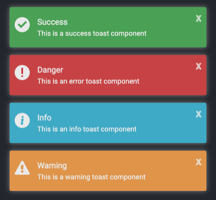
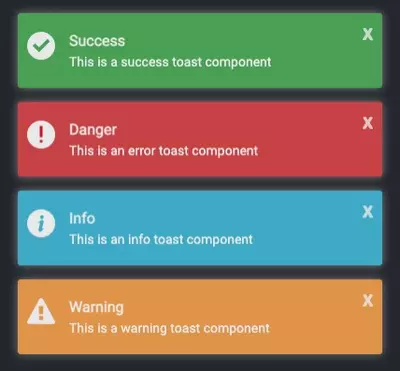
Here is how the toast notifications look after they have been created and named:

Auto-delete toast after 3 seconds

Getting started
The React experience level required for this tutorial is beginner to intermediate.
To demonstrate how to create custom toast components, we must first create a React application. I’ll assume that Node.js is already installed on your computer. Node.js comes with npx, and we’ll use create-react-app with npx to create our React app.
Open a terminal, navigate to the directory where you want to add your project, and type
npx create-react-app react-toastYou can give the project any name you wish. No other module will be installed inside the project. We’ll simply use the modules added by the create-react-app tool.
The default folder structure looks like this:
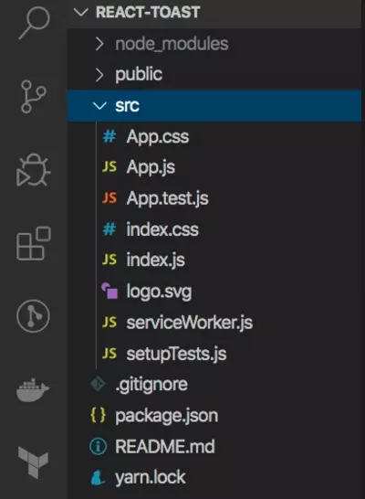
Inside the src, create a new folder called components (we will add our toast and button components to this components folder).
In React, you can either use class components, which require you to extend a React.Component and create a render function that returns a react element, or functional components, which are plain javascript functions that accept props and return React elements. We'll use functional components for this tutorial. By default, create-react-app uses functional components.
Inside the App.js component, you can remove the content of the header element and change the header to a div with className="app". The parent element should be an empty element tag. We’ll also change the function to an arrow function (that’s just my personal preference; feel free to use the default function if you wish).
import './App.css';

const App = () => {
    return (
        <>
            <div className="app">

            </div>
        </>
    );
}
export default App;
Next, add the CSS style to the App.css file. Delete the contents of the App.css and add the styles to the file. You can obtain CSS styles HERE.
Some of the elements with styles in the css file have not been added. We’ll add these elements as we progress. The styles consist of some simple CSS properties.
Creating a toast component
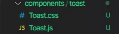
Now, let’s create our toast component. Create a folder called toast inside the components directory and add two files, Toast.js and Toast.css. We are using .js extension for our javascript files as well as CSS (Optionally, you can use JSX and SCSS files).
Inside the Toast.js file, create an arrow function called Toast and export the function as the default. Set the parent element to empty tags.
const Toast = () => {
    return (
        <>

        </>
    )
}
export default Toast;
The function will always return a React element. The first element to add is the notification container, which wraps every notification toast element that is displayed.
<div className="notification-container">
</div>
Later, we'll add a dynamic property to display the position of the notification container. We'll add other elements inside the container to display the button, image, title, and message.
<div className="notification toast">
    <button>
        X
    </button>
    <div className="notification-image">
        <img src="" alt="" />
    </div>
    <div>
        <p className="notification-title">Title</p>
        <p className="notification-message">Message</p>
    </div>
</div>
The button is used to close a particular toast notification. An image icon is displayed depending on the type of toast. Basically, there are four types of toast here:
- Success
- Danger
- Info
- Warning
Import the Toast.css file into the component and add the CSS style given below for the notification container to the Toast.css file
.notification-container {
    font-size: 14px;
    box-sizing: border-box;
    position: fixed;
}
There will be four different positions for the toast elements:
- Top right
- Bottom right
- Top left
- Bottom left
Shown below are the CSS styles for the position.
.top-right {
    top: 12px;
    right: 12px;
    transition: transform .6s ease-in-out;
    animation: toast-in-right .7s;
}

.bottom-right {
    bottom: 12px;
    right: 12px;
    transition: transform .6s ease-in-out;
    animation: toast-in-right .7s;
}

.top-left {
    top: 12px;
    left: 12px;
    transition: transform .6s ease-in;
    animation: toast-in-left .7s;
}

.bottom-left {
    bottom: 12px;
    left: 12px;
    transition: transform .6s ease-in;
    animation: toast-in-left .7s;
}
The positions are added dynamically, depending on which position props the user adds to the toast component.
The next CSS styles are for styling the notification class, which contains the remove button, image, title, and message, as well as animations for sliding the toast to either the left or right of the page. Copy the styles from the github repo and add to the Toast.css file.
Get the css toast component here
To see what the toast component looks like, let’s add some properties, such as the position, to be passed as props inside the toast component.
Props, or properties, are used for passing data from one component to another in React.
The toast component takes in two props: these are toastList and position. toastList is an array that contains objects, and position determines the placement of the notification container on the page. Let's add a props parameter to the toast function and then use ES6 object destructuring to get the toastList and position props.
const Toast = (props) => {
    const { toastList, position } = props;

    return (
        <>
            ...
        </>
    )
}

export default Toast;
To use the position prop, add it to the element with the className of the notification-container. Remove the class from the notification container, and then add
className={`notification-container ${position}`}Next, remove the class from notification div and add the following
className={`notification toast ${position}`}Whatever position prop is passed into the toast component, it will be added as a class to those elements (remember we already set the CSS position properties in the CSS file).
Since the toastList is an array, we can loop through it directly in the HTML; in this case, however, I am not going to do that. Instead, I'll use the useState hook to create a new property. useState hook allows you to create a stateful variable, and a function to update it .
First, import the useState and useEffect hooks from React where the useState is used to create a variable and function to update the variable. The useEffect hook is called when re-rendering is required.
import { useState, useEffect } from 'react';Add this after the props destructuring
const [list, setList] = useState(toastList);The default value of the useState list will be whatever the default value of the toastList array is.
Add the useEffect method and use the setList to update the list property.
useEffect(() => {
    setList(toastList);
}, [toastList]);
The useEffect hook takes a function and an array of dependencies. The setList method is used to update the list array whenever a new object is added to the toastList array, which is passed as a prop. The array consists of dependencies that are observed whenever there is a change to their values. In other words, the useEffect method will always be called when there is an update to the values in the dependencies array.
Let's loop through the list array inside the HTML. We'll use the map method to loop through the array.
import { useState, useEffect } from 'react';

import './Toast.css';

const Toast = props => {
    const { toastList, position } = props;
    const [list, setList] = useState(toastList);

    useEffect(() => {
        setList(toastList);
    }, [toastList]);

    return (
        <>
            <div className={`notification-container ${position}`}>
                {
                    list.map((toast, index) =>
                        <div
                            key={index}
                            className={`notification toast ${position}`}
                        >
                            <button>
                                X
                            </button>
                            <div className="notification-image">
                                <img src={toast.icon} alt="" />
                            </div>
                            <div>
                                <p className="notification-title">{toast.title}</p>
                                <p className="notification-message">
                                    {toast.description}
                                </p>
                            </div>
                        </div>
                    )
                }
            </div>
        </>
    );
}
The structure of the objects to be added to the toastList array looks like this:
{
    id: 1,
    title: 'Success',
    description: 'This is a success toast component',
    backgroundColor: '#5cb85c',
    icon: ''
}
Here, we’ll add the background color of the toast dynamically. To do this, we need to add a style property to the notification element. On the element with class notification toast, add a style property that uses the backgroundColor from the list. Add it after the className
style={{ backgroundColor: toast.backgroundColor }}Let us now use this component inside the App component. Go into the App component and import the toast component.
import Toast from './components/toast/Toast';After the div element with the class name of the app, add the toast component.
<Toast />We need to pass the props into the toast component. Go to the Github repo and download the SVG files for the toast icons. Create a new directory called assets inside the src folder and add all the SVG files.
Create a new file called toastProperties.js in the root of the src folder. Add the content given below to the file.
import checkIcon from './assets/check.svg';
import errorIcon from './assets/error.svg';
import infoIcon from './assets/info.svg';
import warningIcon from './assets/warning.svg';

export const TOAST_PROPERTIES = [
  {
    id: Math.floor((Math.random() * 101) + 1),
    title: 'Success',
    description: 'This is a success toast component',
    backgroundColor: '#5cb85c',
    icon: checkIcon
  },
  {
    id: Math.floor((Math.random() * 101) + 1),
    title: 'Danger',
    description: 'This is an error toast component',
    backgroundColor: '#d9534f',
    icon: errorIcon
  },
  {
    id: Math.floor((Math.random() * 101) + 1),
    title: 'Info',
    description: 'This is an info toast component',
    backgroundColor: '#5bc0de',
    icon: infoIcon
  },
  {
    id: Math.floor((Math.random() * 101) + 1),
    title: 'Warning',
    description: 'This is a warning toast component',
    backgroundColor: '#f0ad4e',
    icon: warningIcon
  }
];

export const BUTTON_PROPS = [
  {
    id: 1,
    type: 'success',
    className: 'success',
    label: 'Success'
  },
  {
    id: 2,
    type: 'danger',
    className: 'danger',
    label: 'Danger'
  },
  {
    id: 3,
    type: 'info',
    className: 'info',
    label: 'Info'
  },
  {
    id: 4,
    type: 'warning',
    className: 'warning',
    label: 'Warning'
  },
];
Each icon will be used for the different types of toast notification: success, danger, info and warning.
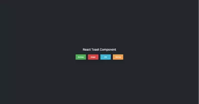
To try out the toast component, import the TOAST_PROPERTIES array in the app component (this is just for testing purposes)
import { TOAST_PROPERTIES } from './toastProperties';Pass the TOAST_PROPERTIES as a prop to the toast component and set the position to bottom-right.
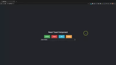
<Toast
    toastList={TOAST_PROPERTIES}
    position="bottom-right"
/>
Remember that the toastList and position are props that we destructured inside the toast component.
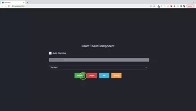
Open the project in a terminal and run npm start or yarn start to start the server. The server should run on port 3000. The result on the browser is as follows:
Let's add some prop-types to the toast component. React provides type-checking features to verify that components receive the correct type of props. PropTypes is a feature that helps to ensure that components receive the right type of props.
Import prop-types. The toast component expects two props: toastList and position.
import PropTypes from 'prop-types';Add the following props check below the toast component arrow function.
Toast.propTypes = {
    toastList: PropTypes.array.isRequired,
    position: PropTypes.string.isRequired
}
The position and toastList props are required.
Now that we've built a toast component and seen how the components look, let's create a button component and use the buttons to trigger the toast notifications.
Create a new folder called button and add a file called Button.js. Paste the code below inside the file.
import PropTypes from 'prop-types';

const Button = props => {
    const { label, className, handleClick } = props;
    return (
        <>
            <button className={className} onClick={handleClick}>
                {label}
            </button>
        </>
    );
}

Button.propTypes = {
    label: PropTypes.string.isRequired,
    className: PropTypes.string.isRequired,
    handleClick: PropTypes.func
}

export default Button;
The props required inside the button components are the label, className, and handleClick, which is the onClick method on the button. All we need to do is pass the props to the button component.
Inside the app component, add BUTTON_PROPS to the toastProperties import.
import { BUTTON_PROPS, ... } from './toastProperties';The reason for adding this array is so that we can pass the Button component inside a loop with the different properties.
Inside the div element with the class app, add
<p>React Toast Component</p>
<div className="toast-buttons">
    {
        BUTTON_PROPS.map(e =>
            <Button
                key={e.id}
                className={e.className}
                label={e.label}
                handleClick={() => showToast(e.type)}
            />
        )
    }
</div>
Instead of creating four different buttons, we use one button inside a loop. The loop displays the number of buttons according to the length of the BUTTON_PROPS.
Create a function called showToast and pass a parameter called type.
const showToast = (type) => {
}
Import the useState hook and then create a new property called list.
const [list, setList] = useState([]);When any button is clicked, the app displays the corresponding toast, depending on the position selected by the user.
Inside the showToast method, we'll use the Javascript find method to get the corresponding toast object from TOAST_PROPERTIES and into the toastList array.
const toastProperties = TOAST_PROPERTIES.find((toast) => toast.title.toLowerCase() === type);
setList([...list, toastProperties]);
The list array is first destructured using the spread operator and the toastProperties object is added. The setList method is used to update the list array.
The toast component inside the app component should now look like this:
<Toast
    toastList={list}
    position="bottom-right"
/>
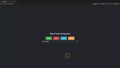
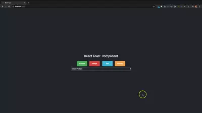
Here, we are using the bottom-right position to place the toast notifications. Let us create a select tag where the user can select a position from the dropdown.
Add these divs before the toast-buttons div inside the App component.
<div className="select">
    <select
        name="position"
        value={position}
        onChange={selectPosition}
        className="position-select"
    >
        <option>Select Position</option>
        <option value="top-right">Top Right</option>
        <option value="top-left">Top Left</option>
        <option value="bottom-left">Bottom Left</option>
        <option value="bottom-right">Bottom Right</option>
    </select>
</div>
The select tag has the name, value, and onChange properties. Whenever an option is selected, the position property is updated and set to the value property on the select tag. The position is updated using a useState method and inside the selectPosition method of the onChange. Add a new useState method
const [position, setPosition] = useState();Create a function called selectPosition, which takes in a parameter called event. Inside this method, we'll pass the event.target.value into the setPosition to update the position based on the option selected by the user. We'll also pass an empty array into the setList method, which will always clear the list array whenever a new position from the tag is selected.
const selectPosition = (event) => {
    setPosition(event.target.value);
    setList([]);
}
Setting the position prop on the toast component to the useState position variable, the toast component inside the app component should look like this:
const selectPosition = (event) => {
    setPosition(event.target.value);
    setList([]);
}
Top right
Top left
Bottom left
Bottom right
Now that we have seen how to create a toast component and then display toast notifications when buttons are clicked, let us add a method to delete a toast from the page and from the toastList array.
We'll use the javascript findIndex and splice methods. We'll also use the unique id of the toast inside the toastList object array to find the index of the object and use the splice method to remove the object from the array, thereby clearing the particular toast from the page.
Go into your toast component. On the button element, add an onClick using a method called deleteToast, which takes the toast id as a parameter.
onClick={() => deleteToast(toast.id)}Create a deleteToast method.
const deleteToast = id => {
    const index = list.findIndex(e => e.id === id);
    list.splice(index, 1);
    setList([...list]);
}
Having got the index of the toast object inside the list array, the index is used inside the splice method that removes the property at that index from the array. The number 1 lets the splice method know we want to remove only one value.
After removing the toast, we use the spread operator to update the list array using the setList method. That's all you need to do to delete a toast notification.
See the full source code for this tutorial in the Github repo.
Auto-delete a toast notification
Toast notifications can be auto-deleted by adding a delete functionality inside the Javascript setInterval method after a certain time has passed.
The toast notification component will take two new props:
autoDelete - a boolean that determines if the notification needs to be deleted.
autoDeleteTime - a number in milliseconds
Add the new properties to the props object in the toast component.
const { ..., autoDelete, autoDeleteTime } = props;Multiple useEffect methods in React can be added to a functional component as long as the order in which they are called is retained.
Add another useEffect method.
useEffect(() => {
}, []);
Inside this useEffect, add the setInterval() method
useEffect(() => {
    const interval = setInterval(() => {

    }, autoDeleteTime);
}, []);
The second parameter of the setInterval method is the autoDeleteTime, which is a number in milliseconds that determines how the setInterval method is called. The interval variable is a number that needs to be cleared by calling the clearInterval() method. The clearInterval() method clears a timer set with the setInterval() method. The interval is cleared inside a useEffect cleanup method.
useEffect(() => {
    const interval = setInterval(() => {

    }, autoDeleteTime);
    return () => {
        clearInterval(interval);
    }
}, []);
The cleanup method is called after the useEffect method unmounts and starts a new re-render. If the clearInterval method is not called, the interval variable will always hold the last timer value, which will cause issues with how the setInterval method is called.
Let's update the deleteToast method by removing items from the toastList array.
const deleteToast = id => {
    ...
    ...
    const toastListItem = toastList.findIndex(e => e.id === id);
    toastList.splice(toastListItem, 1);
    ...
}
Whenever an item is removed from the list array, that same item is deleted from the toastList array. The deleteToast method is called inside the setInterval().
The autoDelete property is a boolean that determines if the notifications are to be automatically removed after a certain time. If the property is true, the notifications are auto-deleted. Otherwise, they are not automatically deleted.
Inside the setInterval(), we need to check if the autoDelete is true and if list and toastList arrays have values in them. Remember that the deleteToast method requires an id parameter to remove the toast from the arrays. We obtain the id of the first item in the toastList array and pass it into the deleteToast method.
useEffect(() => {
    const interval = setInterval(() => {
        if (autoDelete && toastList.length && list.length) {
            deleteToast(toastList[0].id);
        }
    }, autoDeleteTime);
    return () => {
        clearInterval(interval);
    }
}, []);
Each time the setInterval is called, the id of the item at index 0 is passed into the delete method. This method is skipped if toastList and list arrays have no more values in them.
Add these to the props validation
Toast.propTypes = {
    ...
    autoDelete: PropTypes.bool,
    autoDeleteTime: PropTypes.number
}
Now that we've updated the toast component with the new properties, let's add the values as props to the component from inside the App component. For demonstration purposes, I will add a checkbox input and a text input so that the user can dynamically set the values of the props. Add two useState variables inside the App component.
let [checkValue, setCheckValue] = useState(false);
const [autoDeleteTime, setAutoDeleteTime] = useState(0);
Create a new folder called checkmark inside the components directory. Add a Checkmark.js and Checkmark.css files.
Add the code below to Checkmark.js.
import PropTypes from 'prop-types';

import './Checkmark.css';

const Checkmark = props => {
    const { label, checkValue, onCheckBoxChange } = props;

    return (
        <>
            <label className="checkmark-container">{label}
                <input
                    id="auto"
                    type="checkbox"
                    name="checkbox"
                    value={checkValue}
                    onChange={onCheckBoxChange}
                />
                <span className="checkmark"></span>
            </label>
        </>
    );
}

Checkmark.propTypes = {
    label: PropTypes.string.isRequired,
    checkValue: PropTypes.bool.isRequired,
    onCheckBoxChange: PropTypes.func
}

export default Checkmark;
You can get the Checkmark.css code here.
Inside the div with className select in the App component and before the select dropdown element, add Checkmark component.
<Checkmark
    label="Auto Dismiss"
    checkValue={checkValue}
    onCheckBoxChange={onCheckBoxChange}
/>
<br />
Add the method onCheckBoxChange.
const onCheckBoxChange = () => {
    checkValue = !checkValue;
    setCheckValue(checkValue);
    setList([]);
}
This method sets the checkbox element value.
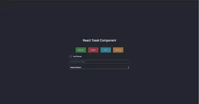
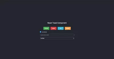
Let's disable the buttons until a position is selected from the select dropdown, and disable the input if the auto dismiss checkbox is unchecked. To do this, add the string Select Position to the useState method for position.
const [position, setPosition] = useState('Select Position');Then, on the buttons className, add
className={`${position === 'Select Position' ? `${e.className} btn-disable` : `${e.className}`}`}If the position is the string Select Position, add the class btn-disable and the class name for each button. If the position is not the string Select Position, then add only the button class name.
Let's add an input element that you can use to add an autoDeleteTime.
Add the element after the Checkmark component.
<input
    type="text"
    name="dismiss"
    placeholder="Dismiss time Ex: 3000"
    autoComplete="false"
    onChange={(e) => setAutoDeleteTime(parseInt(e.target.value, 10))}
/>
<br />
The setAutoDeleteTime method is used to update the autoDeleteTime from the input set by the user. We cast the value from a string to a number.
On the input text box for adding the autoDeleteTime, add
<input
    className={`${!checkValue ? 'disabled' : ''}`}
    ...
/>
The input is disabled by default unless the checkbox is checked.
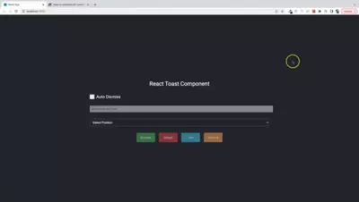
Disabled Buttons and Text Input
Enabled Buttons and Text Input
Update the toast component
<Toast
    toastList={list}
    position={position}
    autoDelete={checkValue}
    autoDeleteTime={autoDeleteTime}
/>
Below is a display of the result of auto-deleting toast notifications.
Auto-delete after 2 seconds
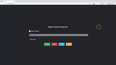
Auto-delete after 3 seconds
Check the full source code for this tutorial on the GitHub repo
Conclusion
We have now created a simple custom toast component that is capable of displaying multiple notifications and used the popular react hooks useState and useEffect. This tutorial has showed how you can display and dismiss a toast notification and customize the toast component any way you please.