Rapid prototyping of data science apps
How to provide data analysis app prototypes to experts or potential users within minutes
- The task
- Getting started
- Loading data
- Labeling data
- Creating our first diagrams
- Formatting using expanders and columns
- Creating plots with interaction
- Correlation
- Creating a prediction model and showing its results
- Showing some prediction metrics
- Deployment
- Result
- Outlook
Industrial manufacturing generates large amounts of data. These may contain valuable information about production efficiency, product quality, or the condition of the equipment. Various statistical methods can be used to identify relevant information. Usually, larger amounts of data are considered informative. However, only a fraction of the data is regarded as relevant for a particular issue (e.g. only measurements from selected sensors). Despite recent developments made so far in automatic root-cause analysis, investigations into a particular area are normally performed iteratively by means of automated data processing, followed by a human expert analysis. Consequently, it is important to provide the functionality for adapting the generated results for experts without software engineering capabilities, since at the beginning of investigations like these, it is often not clear what the final methods, diagrams and results should be for everyday use. It is simply not efficient to spend a lot of time and effort on the development of a particular software functionality that will not be used in the end. This is where rapid app prototyping comes into play.
Many methods of data analysis are freely available and so generic that they can be applied to various tasks. Useful, well-known packages include SciPy or Scikit-learn, for example. At the same time, there are packages available that enable the generation of different types of diagram types. Among the most widely used are Plotly and Matplotlib. Finally, packages such as Streamlit allow for very simple application development that utilizes the available data analysis capabilities and display results in the form of diagrams. Experts can thus investigate the current state of the data analysis and adapt it to their needs. If an application is to be used daily under production conditions, it might be necessary to make it more comprehensive. In this way, functionalities can be integrated into a larger solution, robustness can be increased or certain software standards such as programming languages, specific interfaces, or paradigms can be met.
The task
We have just received the production data for a continuous casting machine. The dataset contains information about the chemical composition of the produced steel, the width and thickness of the slabs cast, the casting speed during production for a specific slab, and the casting machine performance expressed in tons per hour. Can the parameters that affect the productivity of the plant be identified? Is it possible to train a prediction model that can estimate throughput? Can these results be shared with others easily? The answer is yes. We use synthetically generated data in our example, but such tasks may well arise in real world situations. Before a production-ready application is implemented, there is a lot that can be investigated and discussed beforehand.
Getting started
A common starting point would be to take a data set. It might be read from a database or provided in form of a file of some type. In this case, let us assume it is available in a comma-separated values file. The Pandas package is widely used to read data, so this is what we employ here. Generally, the app prototype is built using Streamlit. The import block will therefore look like this:
import pandas as pd
import streamlit as st
Loading data
The data set can be read using the read_csv function in Pandas. It returns the data in the form of a dataframe object. As a rule, this can be done in the actual app code. However, one special feature of Streamlit is that every time a manual user input is detected, the code is evaluated again. Reading larger data sets may take some time and waiting for a diagram update that we may use later is annoying, so we can avoid that by putting the reading in a function of its own and using Streamlit’s cache decorator:
# Loading the dataset
# adding the cache decorator prevent reloading the same data all of the time
@st.cache
def load_dataset(arg):
df_read = pd.read_csv('Synth_data.csv', sep=';')
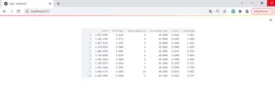
return df_readNow we can call the function with some arbitrary argument. To check the data, we can exploit the fact that Streamlit allows various objects to be displayed, for instance as dataframes.
#read data file
df_raw = load_dataset('default')

# display the data read
st.dataframe(df_raw)
We can start or test our app by running the following command in a Python console:
streamlit run App.pyIt starts the application that is then viewed using a web browser. For now, it does not look that impressive, but remember we have only just got started. At the same time, we can already check to see if the data are being properly read.
Labeling data
When reading data, dataframe columns are named according to the column headers in the data source. In many technical data sources, columns tend to have more or less self-explanatory names. However, they are often not easy to read. To “translate” them, we can use a dictionary that can also be used later for axes labels, table headers, and so on. If you don’t have a source from which you can read the translation, you have to code it yourself. For the sake of simplicity, we’ll set the labels to the original values. This does not change the appearance at this stage, but it allows us to change it later on and still use the same code that we are about to write:
columns_all = list(df_raw.columns)

#generate column labels to be used in diagrams etc.
col_labels = {}
for col in columns_all:
    col_labels[col] = col
    # here labels = column names. If more specific labels are to be used, this has to be set manually case-wise
Creating our first diagrams
A very basic way of examining a dataset is to look at the histograms of the various features. In general, this may include datatypes that cannot be easily or properly displayed in the form of histograms. Here, we will focus on numerical data only, where this is not an issue. Creating a histogram can be implemented in a generic way. So let’s put it in its own function:
# Creates plotly histogram for a given pandas Series.
def create_histogram_plot(data, label):
    import plotly.express as px
    # create histogram
    fig = px.histogram(data, width=750, height = 400)

    # Axes styling
    fig.update_xaxes(showline=True, linewidth=2, linecolor='black',title_font = {"size": 20})
    fig.update_yaxes(showline=True, linewidth=2, linecolor='black',title_font = {"size": 20})

    # Figure styling
    fig.update_layout(
    plot_bgcolor = "#FFF",
    title='Distribution',
    xaxis_title=label,
    yaxis_title='Count [#]',
    showlegend = False,
    bargap = 0.2
    )
    return fig
The function takes the dataframe holding the data and the label as arguments and creates a neatly formatted figure from it. Note that plotly.express is used here. As a rule, the code between line 19 and 31, which contains only styling options, could be dropped. If you want to change the appearance, you can check the Plotly documentation. Obviously, it is a matter of personal preferences.
Applying the function to all our columns will create all the figures. We can include them in the app by using the plotly_chart function in Streamlit:
histograms = {}
for col in columns_all:
# generate histogram for the actual property
histograms[col] = create_histogram_plot(df_raw[col],col_labels[col])
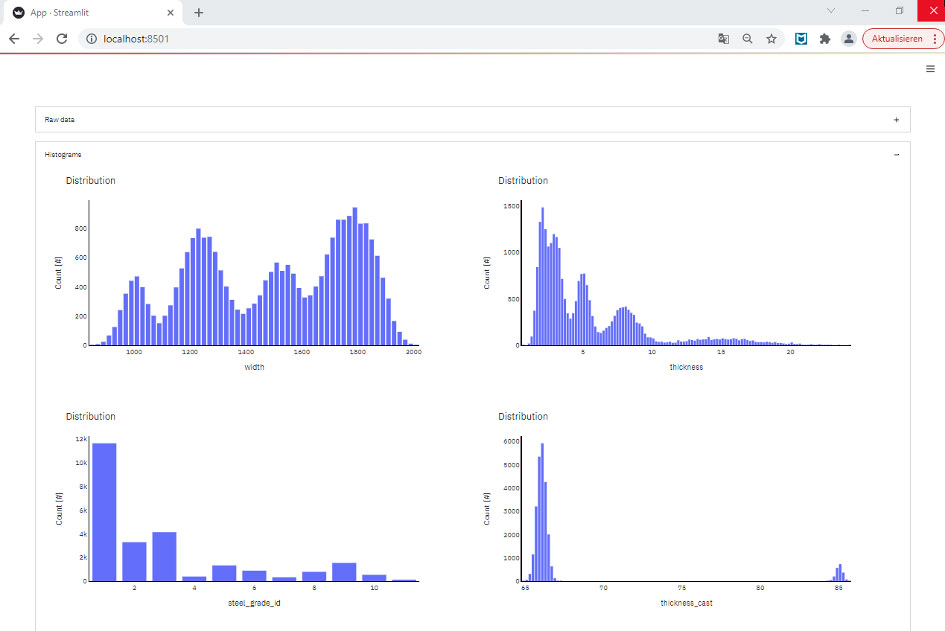
st.plotly_chart(histograms[col])As soon as we reload the page, some illustrative histograms are displayed:
Which is not bad for only fifty lines of code.
Formatting using expanders and columns
So far, though, it does not look particularly appealing to the user and, in the case of further output, you might not want to keep scrolling down. So, let’s apply some styling. First, we can utilize the expander in Streamlit. This allows us to collapse or expand some of the content to be displayed. You can put the code in an expander block like this (I also did it with the dataframe table output):
with st.expander('Histograms'):
    histograms = {}
    for col in columns_all:
        # generate histogram for the actual property
        histograms[col] = create_histogram_plot(df_raw[col],col_labels[col])
        st.plotly_chart(histograms[col])
The result looks like this after reloading the page:

Clicking on one of the boxes will open and show the content we saw before.
If we want to display multiple outputs underneath each other, we can use the columns function. First, we define two columns, col_hist_a and col_hist_b. You can adjust the width, but this is not required here. We then use the “with” statement again to display any content in only one of the columns. In general, we do not know how many columns there could be. Therefore, I decided to display one histogram alternately on col_hist_a (shown on the left) and one on col_hist_b. I implemented it by checking the residual of the modulo of an incremented counter i_col. I’m sure there are other options. However, it works well and independently of the number of figures.
with st.expander('Histograms'):
    histograms = {}
    col_hist_a, col_hist_b = st.columns(2)
    i_col = 0
    for col in columns_all:
        # generate histogram for the actual property
        histograms[col] = create_histogram_plot(df_raw[col],col_labels[col])
        if i_col%2 == 0:
            with col_hist_a:
                #display the histogram in column A
                st.plotly_chart(histograms[col])
        else:
            with col_hist_b:
                #display the histogram in column B
                st.plotly_chart(histograms[col])
        # switch between columns
        i_col+=1
The result is shown in the image below:
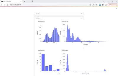
Another issue is that we do not use the full width of our display. This can be adjusted by changing the maximum width using a little workaround:
# sets width of blocks in app
def _max_width_():
    max_width_str = f"max-width: 1600px;"
    st.markdown(
        f"""
    <style>
    .reportview-container .main .block-container{{
        {max_width_str}
    }}
    </style>
    """,
        unsafe_allow_html=True,
    )
On reloading the page, we can now appreciate our histograms in their full size:
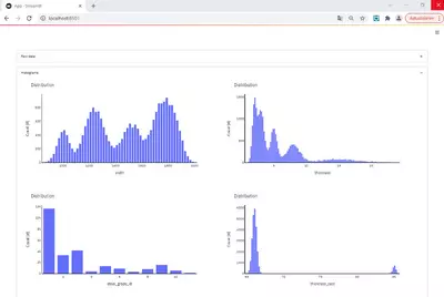
We see that certain width values occur more frequently than others. Also, the majority of production covers rather small strip thicknesses (mostly for material that is further processed in cold rolling facilities). Only a smaller amount of the coils is thicker. There is one standard steel grade and two others that are also quite common. The casting thickness does not differ greatly. Essentially, there are two standard casting thicknesses, and all slabs have a thickness very close to one of these values.
Creating plots with interaction
Another visualization that is commonly used are scatter plots with two features. To create these, we can again define a generic function. That function uses two Pandas series and the corresponding labels as arguments and creates the figure from it. The code can be seen below. Again, the styling is not mandatory and changes can be made according to personal preferences.
# Generates scatter plots for given x and y data pandas Series or array-like
def create_scatter_plot(data1, data2, label1, label2):
    import plotly.graph_objects as go

    # Create traces
    fig = go.Figure()
    fig.add_trace(go.Scatter(x=data1, y=data2,
                    mode='markers',
                    marker=dict(opacity=0.75)))

    # Axes styling...
    fig.update_xaxes(showline=True, linewidth=2, linecolor='black',title_font = {"size": 20})
    fig.update_yaxes(showline=True, linewidth=2, linecolor='black',title_font = {"size": 20})

    # Figure styling...
    fig.update_layout(
    plot_bgcolor = "#FFF",
    width = 750,
    height = 400,
    title='Relation',
    xaxis_title=label1,
    yaxis_title=label2
    )
    return fig
Even with a fairly low number of features, the number of all combinations quickly reaches quite high levels. Since one rarely looks at all of them at once, we can use selectboxes here. A selectbox allows us to pick one item from a list of possible options. In this case, we will enable the user to select two features from the list of all features. Once the two parameters have been chosen, we can use them to obtain the relevant data and pass it to our scatter plot function. Finally, the generated figure has to be displayed in the app. The code looks like this:
# using beta_expanders for structuring the app
with st.expander('Relations'):
    # col_1 = 'steel_grade_id'
    # col_2 = 'carbon'

    #Use selectbox to pick the property displayed on the x-axis. Index is optional and can be set case-specific.
    col_1 = st.selectbox('Select first parameter', columns_all, index = 4)
    #Use selectbox to pick the property displayed on the y-axis. Index is optional and can be set case-specific.
    col_2 = st.selectbox('Select second parameter', columns_all, index = 3)

    # Create the scatter plot for the selected properties
    fig_relation = create_scatter_plot(df_raw[col_1], df_raw[col_2],col_labels[col_1],col_labels[col_2] )
    # display the scatter plot in the app
    st.plotly_chart(fig_relation)
After reloading, the web app looks like this:
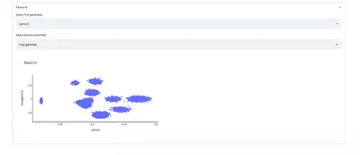
Now, every time a user changes the selection of first or second parameters, the figure is updated. From the example in the image, one can clearly see the islands of different steel grades with varying chemical compositions.
Correlation
Another standard piece of information to look at when starting a dataset analysis is the correlation between the different parameters. There are different correlation coefficients, such as Pearson’s r, Kendall’s tau, or Spearman’s rank. Pearson’s r checks for a linear relationship (which we cannot assume to exist everywhere). Spearman checks for any monotonic relation. There are superior metrics that are capable of detecting other forms of relations too, but we will keep it simple here.
The implementation is not problem-specific. Consequently, we can again write a generic function that receives the data, the labels, and the correlation method to be applied and returns a neat result from it. Pandas comes with a very handy feature that calculates the matrix of correlation coefficients for a given dataframe. The visualization is done using Plotly’s heatmap. Again styling options, color scheme and so on are up to your own personal preference.
# calculates the pairwise correlations using the argument correlation method. Generates a heatmap of correlations
def get_corr_figure(method_corr, df, labels):
    import plotly.graph_objects as go
    # calculates the pairwise correltations
    matrix_corr = df.corr(method = method_corr)

    # Generates Heatmap trace of correlation values
    trace_matrix_corr = go.Heatmap(x=labels,y=labels,z=matrix_corr,colorscale='Bluered')
    data_corr = [trace_matrix_corr]

    # Generates the heatmap figure
    fig = go.Figure(
        data=data_corr,
        layout=go.Layout(
            #title=go.layout.Title(text='Correlation'), width=1200, height=1200
            width=800, height=800))
    return fig, matrix_corr
In the main app code, we can use the function and display the resulting figure:
# using beta_expanders for structuring the app
with st.expander('Correlation'):
    # list of labels required for axes labels
    labels_list = [label for label in col_labels.values()]
    #create correlation figure
    fig, matrix = get_corr_figure('spearman', df_raw, labels_list)
    # display the correlation figure in the app
    st.plotly_chart(fig)
The result looks like this:
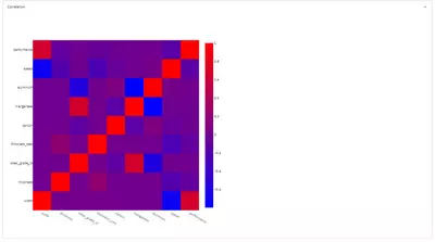
The diagram shows that width has a positive impact on productivity (performance), while the speed has a negative correlation with the width. This can be understood in such a way that, in the case of wide material, the output of a steelmaking plant governs its productivity. Therefore, very wide material might be cast more slowly. Aluminum and manganese concentrations are also negatively correlated. Keep in mind that the data are synthetic and therefore should not be over-interpreted.
Creating a prediction model and showing its results
Creating models is often seen as a scientifically challenging task and data scientists are sometimes regarded as mere artists. This is true, yet when it comes to designing very complex and fundamental learning strategies, it is often possible in practice to achieve reasonable results with off-the-shelf methods. As this post is not about optimizing prediction models, we will keep it simple. We will fit Scikit-learn’s GradientBoostingRegressor to the dataset and visualize the comparison between prediction and real data.
I am fully aware that NOT splitting the data into test and train set, NOT testing different model types, NOT doing hyperparameter optimization, NOT using any other metric but mean squared error, and NOT using unseen data for model evaluation is dramatically over-simplifying the task. It might even result in catastrophic misinterpretations. HOWEVER: None of these topics is important here. This post is just about how to quickly set up an application that provides a certain functionality. The way the model is created can be ignored here.
In our function, we provide the dataframe, a list of parameters to be used for prediction, and the name of the series that is to be approximated by the model as arguments. We then create the model object, fit it to the data, predict values for each row of data, and attach it to the dataframe.
# Creating a prediction model for the target argument property based on the parameters argument features.
# Model type is fixed here, no train/test split, cross-validation or such
# No Hyper-parameter-optimization done here
def create_model(df, parameters, targets):

    from sklearn.ensemble import GradientBoostingRegressor
    # setting the model type
    regressor = GradientBoostingRegressor(n_estimators=100, criterion='mse', max_depth=8)

    #training the model
    regressor.fit(df[parameters], df[targets])
    #predicting values
    predicted_values = regressor.predict(df[parameters])

    # assigning predicted values to dataframe
    df_pred = df.assign(prediction=predicted_values)

    return predicted_values, regressor, df_pred
In the app code, we again implement some user interaction. First, a selectbox allows the target property of the prediction model to be defined. In addition, a multiselect option allows us to pick several parameters that can be used by the prediction model. These selections are then passed to our function that creates the model. The resulting predictions together with the original data are fed into the function create_scatter_plot that we implemented originally to display the raw data.
# using beta_expanders for structuring the app
with st.expander('Model'):
#    target = 'performance'
    # parameters = ['carbon', 'width', 'thickness_cast']
    # default list for the multi-select widget
    parameters_default = ['carbon', 'width', 'thickness_cast']
    # selectbox for the target property, index is optional and can be set case-specific
    #target = st.selectbox('Select target property', columns_all, index = 8)
    # multi-select widget for the feature selection, default is optional and can be set case-specific
    parameters = st.multiselect('Select properties for prediction', columns_all, default = parameters_default)

    #create data model and prediction values
    prediction, model, df_pred = create_model(df_raw, parameters, target)

    #create scatter plot for comparison purposes
    fig_comparison = create_scatter_plot(df_pred[target], df_pred['prediction'],col_labels[target],'predicted')
    #display comparison plot in the app
    st.plotly_chart(fig_comparison)
In the app it looks like this:
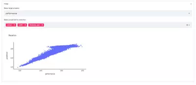
The user can now change the target property to be predicted and the parameters used to describe the target. Based on the selections, the comparison between the actual data and the model predictions can be investigated.
Showing some prediction metrics
For a better comparison of the predictive power of different model settings, it is common to look at several parameters such as mean absolute, mean squared error, or R². Let’s apply some built-in-metrics from Scikit-learn to our predictions. Here, we use the columns from the previous histograms. By doing so, we can neatly arrange the three indicators.
from sklearn.metrics import mean_squared_error, mean_absolute_error, r2_score
from math import sqrt

    # calculate some model accuracy KPIs
    mae = mean_absolute_error(df_pred[target], df_pred['prediction'])
    mse = sqrt(mean_squared_error(df_pred[target], df_pred['prediction']))
    r2 = r2_score(df_pred[target], df_pred['prediction'])

    #Display model performance KPIs in different columns
    col_res_1, col_res_2, col_res_3 = st.columns(3)
    with col_res_1:
        st.subheader('MAE')
        st.header(round(mae,2))
    with col_res_2:
        st.subheader('MSE')
        st.header(round(mse,2))
    with col_res_3:
        st.subheader('R²')
        st.header(round(r2,2))
In the app the result looks like this:
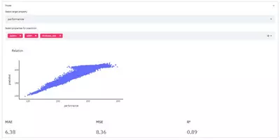
So, we created a model that allows us to predict the productivity of a continuous casting plant with a mean absolute error of 6.38 t/h using just the carbon content, slab width, and casting thickness as input parameters. Bear in mind that the data are synthetic. As mentioned, a meaningful evaluation would need to apply the model on unseen data – therefore the MAE must not be taken for real here. As mentioned, a meaningful evaluation would need to apply the model on unseen data – therefore the MAE must not be taken for real here.
Deployment
The whole application can easily be hosted in a Docker container. We simply have to put the requirements together and set up a Docker file:
matplotlib==3.3.4
numpy==1.19.2
pandas==1.2.2
plotly==4.14.3
streamlit==0.80.0
scikit-learn==0.24.1#FROM: Sets the Base Image for subsequent instructions
FROM python:"3"
#LABEL: adds metadata to an image
#MAINTAINER: sets the Author field of the generated images.
LABEL maintainer="Enter_your_name_here"
#EXPOSE: Informs Docker that the container listens on the specified network ports at runtime.
EXPOSE 8510
ENV STREAMLIT_SERVER_PORT=8510
WORKDIR /app/src
COPY requirements.txt .
#RUN: Execute any commands in a new layer on top of the current image and commit the results.
RUN pip install --upgrade pip
RUN pip install -r requirements.txt
COPY . .
#ENTRYPOINT: allows you to configure a container that will run as an executable.
ENTRYPOINT [ "streamlit", "run"]
#CMD: To provide defaults for an executing container.
CMD ["App.py"]A suitable image can then be built by running
Docker build --tag tag_of_the_app .Once this is done, everyone with access to the hosting server (or if you’d prefer deployment in a cloud environment – feel free) can use your app. Great! Now you can collect feedback from the whole team and adjust either the presentation or the data analytical function in the background.
Result
With merely 200 lines of code, we created a web-app that allows us to:
- Investigate a dataset
- Calculate correlations between parameters
- Enable users to select data to be displayed
- Enable the training of a prediction model for any parameter from the dataset based on the user selection of the set of parameters used by the model
- Show the comparison between actual data and predicted values
- Calculate and display key metrics of prediction model performance.
Not bad at all!
Outlook
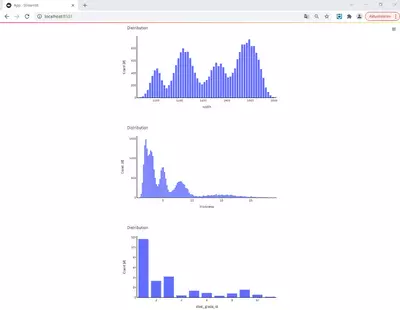
The good thing is that most of the code is not limited to the use case. If we just exchange the data set that is read with one containing information about technological parameters and the mechanical properties of steel strips, we can still use exactly the same code and perform a completely different analysis:
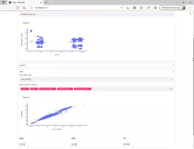
Obviously, there are hundreds of ways to extend the functionality or display other results such as ICE plots, feature importances, or similar. We can allow further options for model creation, for example specifying the type of model to use. Results can be stored differently (particularly larger models, so they don’t have to be trained every time). We can select a particular dataset a priori, and so on. Fortunately, though, this is up to each person working on a particular task.